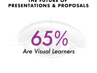
A good visualization can communicate the nature and potential impact of information and ideas more powerfully than any other form of communication.
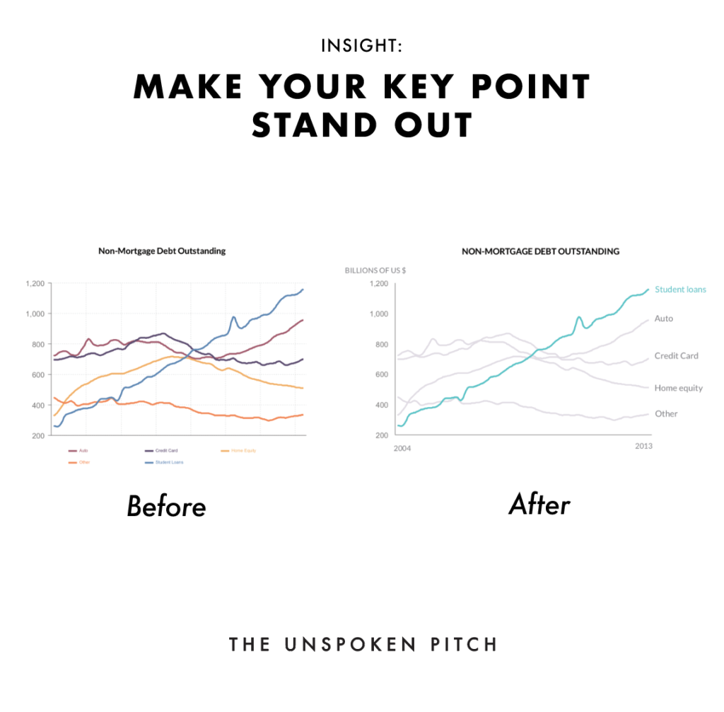
Here we have a graph in the Change of Non-Mortgage Debt Outstanding.
Notice on the left hand side there is a lot of sources of information.
If you were giving a speech, aim to highlight the main point.
In the example on the right hand side
– We made certain lines thicker
– Applied color
– Added data explainers
– Labels to paint a better picture
If you plan on doing this in your next presentation, give this a go and let me know how it goes.
Happy Fridays!
#infographic #unspokenpitch #business #communication #video #funding #howto #pitching #tip #visualization #clarity #datavisualization #presenter #transformations #casestudies #digitalassets #pitch #fundraising #ceos #engagements #storytelling #data
![[ SERIES ] Framework to Summarise Information and Present Visually](https://theunspokenpitch.com/wp-content/uploads/2019/03/3S-Framework-320x240.png)